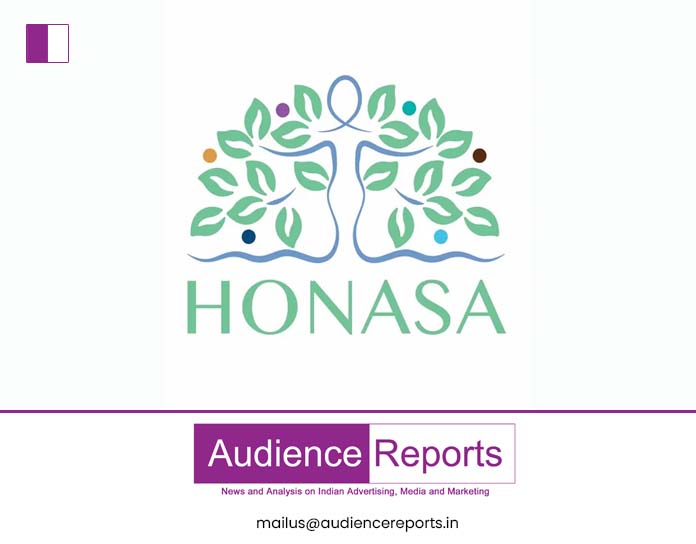
The reimagined corporate identity is composed of three fundamental elements: an elegant female figure, the iconic tree of life, and a spectrum of vibrant circles. Honasa Consumer
Honasa Consumer, the parent company behind well-known brands Mamaearth, The Derma Co., and Aqualogica, has revealed a fresh corporate identity, signifying a significant milestone in its journey of advancement and expansion.
This renewed identity stands as a testament to the company’s unwavering foundation.
The reimagined corporate identity is composed of three fundamental elements: an elegant female figure, the iconic tree of life, and a spectrum of vibrant circles.
The feminine silhouette eloquently captures the nurturing spirit of a mother, paying homage to the brand Mamaearth, which serves as the heart and genesis of the entire enterprise. The tree of life encapsulates the ideals of progress, balance, and prosperity. Lastly, the kaleidoscope of multicoloured circles vividly represents the fruitful outcomes of dedicated toil and the diverse array within the brand portfolio.
The logo represents its core principles of agility, lucidity, and innovation. This unveiling marks a significant chapter for the company as it strides confidently towards the future, upholding its roots while embracing transformation.


